Choosing a living room paint colour is harder than it looks, because the colour on the chart is never the colour on your wall. Light changes it, the sofa changes it, the floor changes it, and the time of day changes it again. The best living room paint colours are not the prettiest names on a chart — they are the ones that still look right at seven in the evening, next to your actual furniture, in your actual light.
This guide works through the choice in the order that matters. Start with the light your room really gets, then the undertone, then the colour family, then the finish, and only then the exact shade. Test before you commit, and test properly — a small patch on the wall is not a test. The ideas below use colour families rather than one brand’s shade names, so they work whatever paint you buy, and none of them needs a repaint to fix a rushed decision.
Start with the light, not the chart
Every living room has its own light, and the paint has to suit that light, not the light in the shop. A north-facing room gets cool, soft light all day, so colours in it tend to look greyer and cooler than they do on the chart. A south-facing room gets strong, warm light, so the same colour looks brighter and warmer there. A room with one small window gets far less light than a room with a wide one, however pale the walls are.
Watch the room for a full day before you choose. Notice where the light falls in the morning, where it falls in the afternoon, and what the room looks like after dark under your lamps. A colour that looks calm in morning light can look flat under a warm lamp, and a colour that looks rich in the evening can look dull at noon. The room’s light is the first fact; the chart is only a suggestion.
If the room is dark, do not reach for the brightest white on the chart. A bright white in a dark room often looks grey and cold, because there is not enough light for it to bounce. A warm white or a very pale warm greige does better — it has enough warmth of its own to hold up when the light is weak. The same thinking runs through our small living room design ideas, where the wall colour is chosen for the light the room actually has, not the light in a photograph.
Learn to read the undertone
Every neutral has an undertone — a quiet hint of another colour sitting underneath it. A warm white can lean yellow, pink or green. A grey can lean blue, green or violet. A beige can lean pink or yellow. The undertone is what makes two whites look completely different on the wall, and it is what makes a colour clash with a sofa that seemed to match it in the shop.
Compare the swatch against a plain white sheet of paper, not against other swatches. On its own, a warm white looks white; next to true white, its yellow or pink undertone shows clearly. Then hold it next to the fixed things in your room — the floor, the sofa, the curtains, the fireplace stone. If the undertone fights with any of them, it will fight with them every day, and no amount of furniture will fix it.
Match undertones, not names. A pink-undertoned white pairs well with a pink-undertoned beige, but badly with a yellow-undertoned cream. A blue-grey pairs well with cool textiles and pale wood, but badly with a warm terracotta rug. When the undertones agree, the room looks calm even if the colours are different; when they disagree, the room looks restless even if the colours are close.
Warm white is the safest starting point
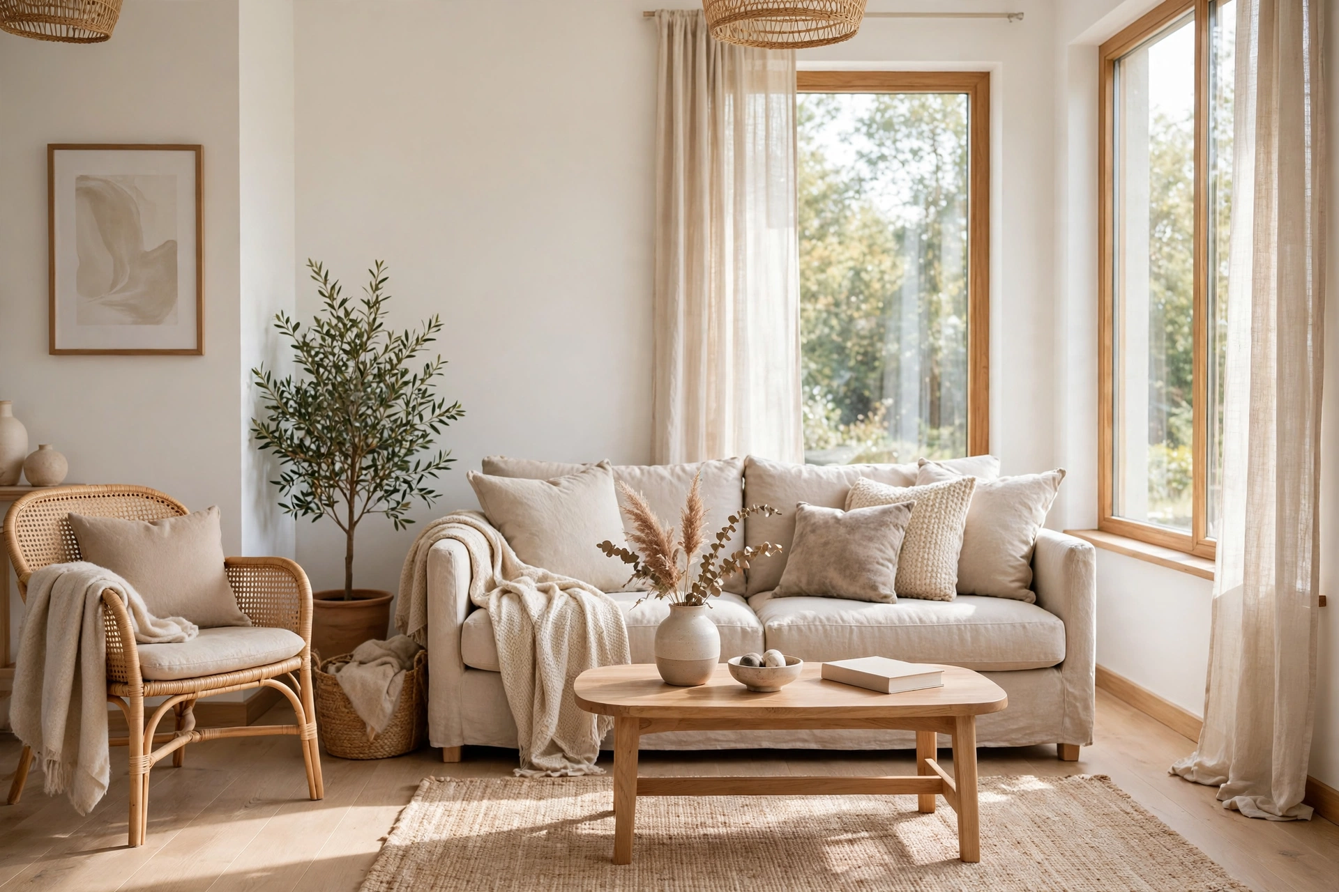
If you want one colour that works in most living rooms, it is a warm white. Not a bright, blue-white, and not a cream — a white with a gentle warm undertone that keeps the walls soft in daylight and calm after dark. It reflects light without glaring, it suits pale wood and dark wood alike, and it lets the furniture and textiles carry the colour of the room.
Warm white is also the most forgiving colour to live with. It does not date the way a strong colour does, it does not fight with a new sofa or a new rug, and it can be repainted over easily if you ever want a change. In a room that already has strong furniture or strong art, a warm white wall is often the best choice, because it gives those pieces room to breathe instead of competing with them.
Keep the ceiling and the woodwork the same warm white, or a shade lighter, so the room reads as one continuous surface. The fewer visual edges in the room, the larger and calmer it feels — the same continuity our Scandinavian living room ideas use to make a pale room feel bright without feeling cold, and it works just as well behind warmer furniture.
Greige does the work of grey and beige together
Greige — grey mixed with beige — is the neutral for rooms that need a little more depth than white can give. A warm greige on the walls makes a living room feel grounded and calm, and it sits comfortably with both cool and warm furniture, which is why it suits rooms where the sofa, the floor and the rug do not all share one temperature.
Choose the greige by its undertone, not its name. A greige that leans warm suits wood floors and linen sofas; a greige that leans cool suits grey furniture and pale stone. In a small room, a pale greige keeps the walls light while still giving them presence; in a large room, a mid-tone greige stops the walls from feeling empty. Test it on the wall that faces the window, where the light will show its undertone most honestly.
Pair greige walls with white woodwork and a pale ceiling, so the room keeps its brightness. A greige room with greige woodwork can feel flat, because nothing separates the wall from the frame around it. The white trim is what gives the greige its edge, and it is what stops the room from looking like a single block of colour.
Soft sage and muted green calm a busy room
A soft sage green is the gentlest way to put real colour on a living room wall. It is quiet enough to live with every day, it suits wood and linen naturally, and it makes a room feel calm without making it feel dark. Sage works especially well in rooms that face a garden or a view of trees, because it brings a little of the outside in without painting the room green.
Keep the sage muted and grey-toned, not bright or yellow. A sage that is too vivid reads as a feature colour and demands attention all day; a sage that is soft and grey reads as a neutral with a little life in it. Use it on all four walls in a room with good light, or on one wall behind the sofa in a darker room, where it adds depth without closing the room in.
Pair sage walls with warm wood, cream linen and one darker green accent — a cushion, a plant, a throw — so the colour repeats in the room instead of sitting alone on the wall. Our modern farmhouse living room ideas, published earlier today, use the same muted sage as their one accent, and the two articles agree for a reason: a quiet green is the accent that fights with nothing.
Dusty blue suits rooms with strong light
A dusty, grey-blue is the cool counterpart to sage, and it suits rooms with strong, warm light best. In a sunny room it cools the glare and makes the light feel softer; in a cool, north-facing room it can look cold, so it needs warm wood and warm lamps beside it to balance the temperature. Choose the blue by the light, not by the chart.
Use dusty blue where you want the room to feel calm and a little formal — a reading corner, the wall behind a bookcase, or the whole room if the light is strong enough. Keep the blue muted and grey, never bright or saturated, and pair it with cream, pale wood and soft white textiles. A bright blue wall demands attention; a dusty blue wall gives the room a quiet depth.
Test dusty blue in the evening as well as in daylight. Under a warm lamp, a blue-grey wall can turn a little violet, and that shift is only a problem if you did not expect it. A large swatch, left on the wall for a day and checked in morning, afternoon and evening light, will tell you whether the shift is pleasant or whether a warmer blue would suit the room better.
Warm terracotta and clay, used sparingly
A warm terracotta or clay colour is the boldest choice in this guide, and the one that needs the most restraint. On one wall — behind the sofa, or around a fireplace — it gives a living room a warmth and a depth that no neutral can match. On all four walls it can overwhelm a small room and make a large room feel smaller than it is.
Choose a terracotta that is muted and earthy, not orange and bright. The colour should look like clay, not like paint, and it should sit comfortably next to wood, linen and cream. Pair it with pale walls elsewhere in the room, so the terracotta wall reads as a feature rather than as the room’s whole identity, and keep the textiles plain so the wall can do the talking.
Terracotta suits rooms with warm light and warm wood best, and it suits a room with a fireplace particularly well, because the colour and the fire share the same warmth. If the room is cool and dark, a terracotta wall can look muddy; in that case a warm greige or a soft sage will give the room warmth without the risk.
Test the colour in your own light
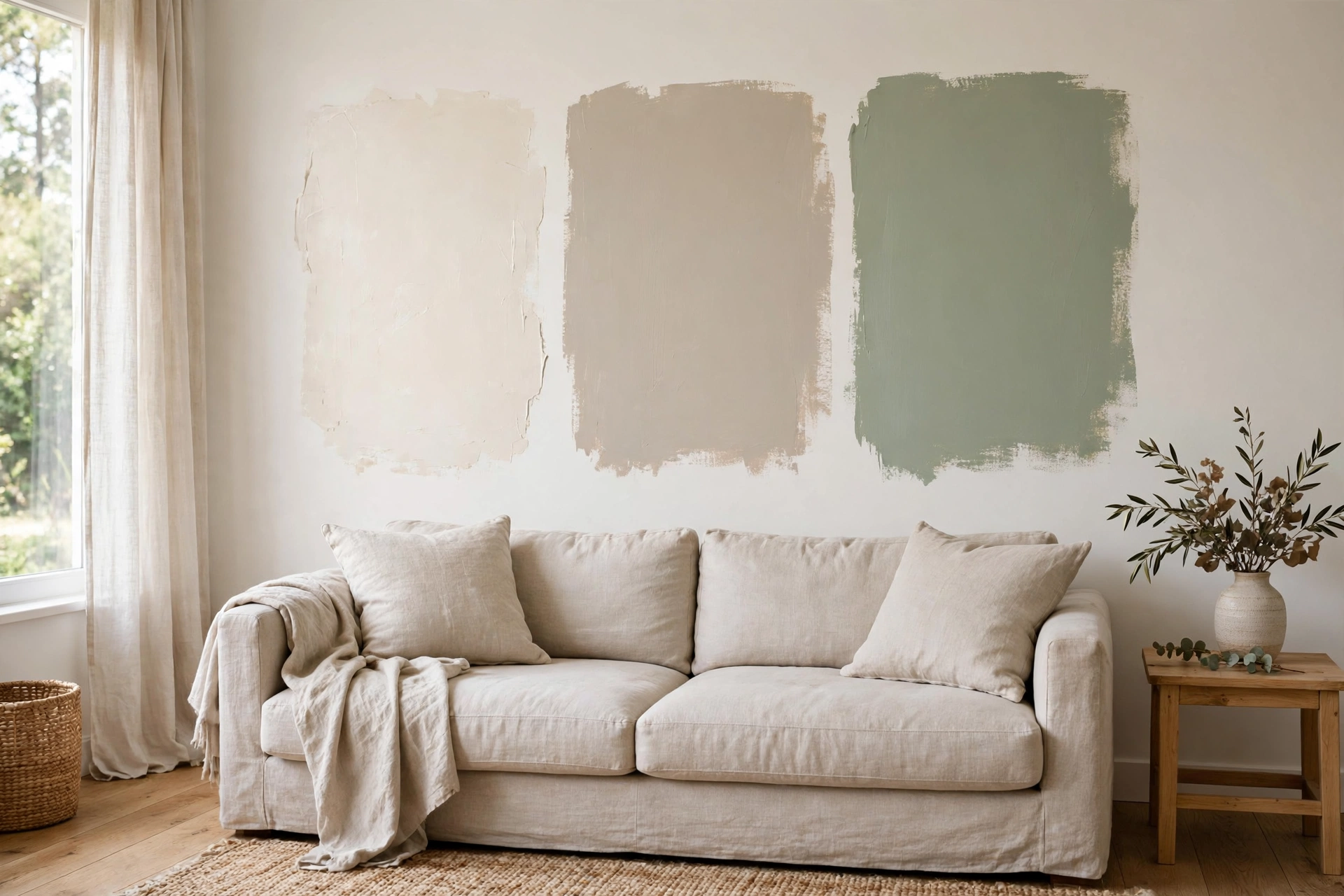
A paint swatch the size of a stamp tells you nothing. Test with a large patch — at least a square foot, and bigger if you can — painted directly on the wall you will live with, or on a large board you can move around the room. A small patch hides the undertone; a large patch shows it, especially at the edges where it meets the woodwork.
Live with the test patch for at least two days. Check it in the morning, at noon, in the late afternoon, and in the evening under your lamps. Move the board to the darkest corner and to the brightest wall, and look at it next to the sofa and the rug. A colour that passes all of those checks is a colour you can buy with confidence; a colour that only looks right in one light is a colour that will disappoint you every other hour of the day.
Test two or three colours at once, side by side, and compare them against each other rather than against the chart. The comparison makes the undertones obvious in a way that a single swatch never does, and it often shows that the colour you liked least on the chart is the one that looks best on your wall. For a room where the wall colour has to work hard in a small space, the same test-first thinking shapes our small bedroom design ideas, where a pale, warm wall is what lets a compact room feel bigger.
Pick the finish for the wall, not the tin
The finish — matt, eggshell, satin, gloss — changes how a colour looks as much as the colour itself. A matt finish softens a colour and hides small marks on the wall, which is why it suits living room walls best. An eggshell finish adds a faint sheen and wipes clean more easily, which suits a room with children or pets. A satin or gloss finish reflects far more light, which can make a colour look brighter and harsher than you expected.
Use matt or eggshell on the main walls, and keep any sheen for the woodwork. A satin finish on skirting boards and door frames gives them a clean edge against a matt wall, and it stands up to scuffs far better than a matt finish would. A gloss finish belongs on a front door or a piece of furniture, not on a living room wall, where it shows every bump and every brush mark.
Remember that the same colour looks darker in a matt finish and lighter in a glossier one, because the glossier surface reflects more light. If you change the finish, test the colour again in that finish — a swatch in matt will not tell you how the same colour looks in eggshell, and the difference on a whole wall is larger than it looks on a small patch.
Keep the whole room in the same family
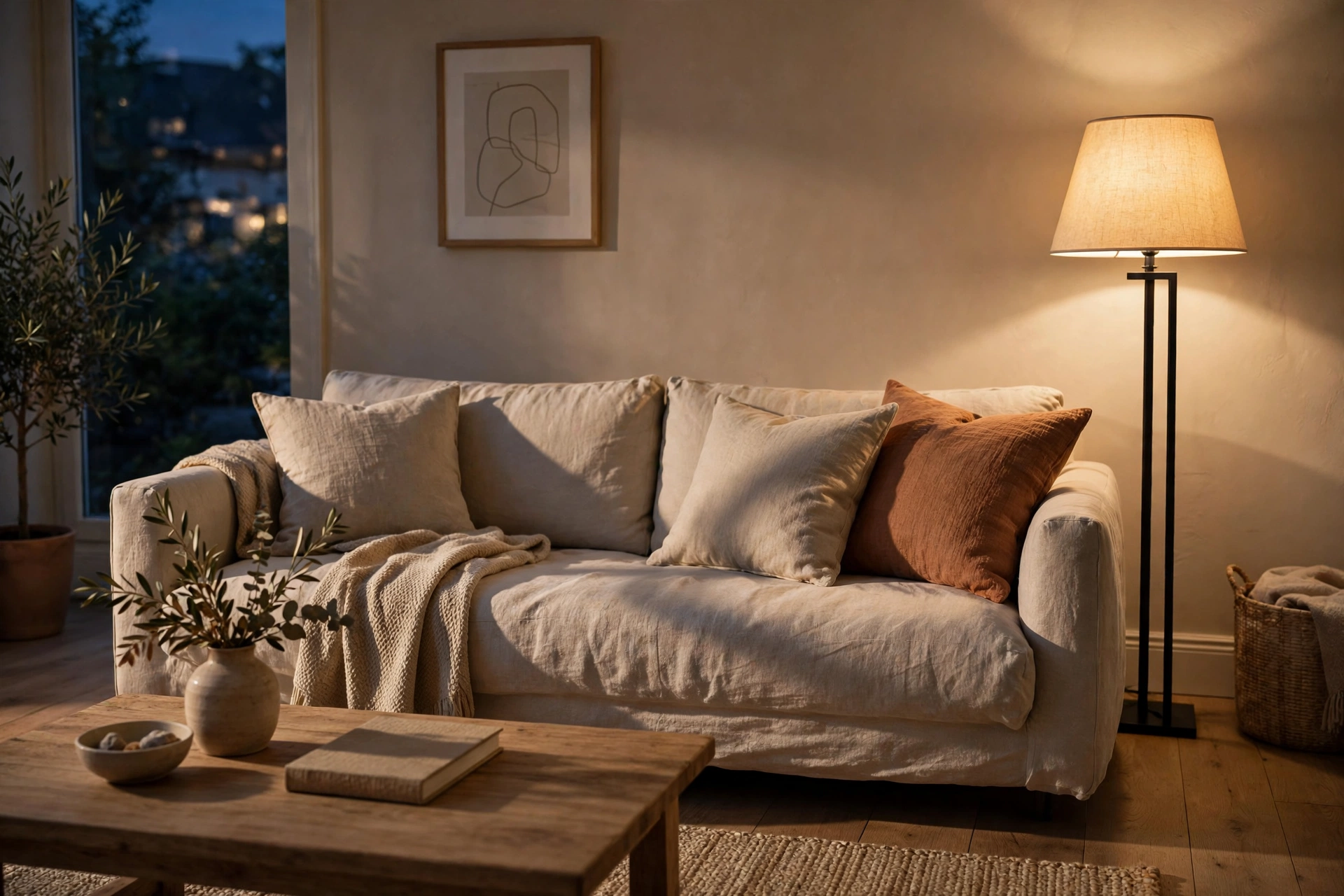
A wall colour does not live alone. It has to agree with the floor, the sofa, the curtains, the rug and the woodwork, and the easiest way to make it agree is to keep the whole room in the same colour family. Warm walls with warm wood and warm textiles; cool walls with cool textiles and pale stone. A room where every element shares one temperature looks calm, even when the colours themselves are different.
Carry the wall colour into the room in small amounts, so it does not sit alone on the wall. A cushion in a softer version of the wall colour, a throw in the same family, or a vase in a deeper tone of it will tie the wall to the furniture. The repetition does not have to match exactly — it has to share the same undertone, which is what the eye actually reads as matching.
When in doubt, simplify. A room with one wall colour, one wood tone that leads, and one muted accent is almost always better than a room with three wall colours and two accents fighting for attention. The same discipline runs through our interior design styles guide, where each style is defined as much by what it leaves out as by what it puts in — and a paint choice is no different.
Frequently asked questions
What is the best paint colour for a small living room?
A warm white or a very pale warm greige, because both reflect the light the room has without going cold. Keep the ceiling and woodwork the same pale tone so the room reads as one continuous surface, and let the furniture carry the colour.
Should living room walls be warm or cool?
It depends on the light. A north-facing or dark room usually suits warm colours, which add the warmth the light lacks. A sunny, south-facing room can take cool colours such as dusty blue or a cool greige, because the strong light warms them up.
How do I know if a paint colour has a pink or yellow undertone?
Hold the swatch against a plain white sheet of paper. Next to true white, the undertone shows clearly — a pink, yellow, green or blue hint that was invisible on its own. Then hold it next to your floor and sofa to check whether the undertone agrees with them.
Is greige better than grey for a living room?
For most living rooms, yes. A warm greige is more forgiving than a pure grey, because its beige side suits wood and linen while its grey side suits cool furniture. A pure grey can look cold in a room without strong light, while greige holds its warmth.
What paint finish is best for living room walls?
Matt or eggshell. Matt softens the colour and hides small marks; eggshell adds a faint sheen and wipes clean more easily. Keep satin for the woodwork, and avoid gloss on walls, where it shows every bump and brush mark.
How long should I test a paint colour before buying?
At least two days, with a large patch on the wall, checked in morning, afternoon and evening light, and next to the sofa and rug. A colour that looks right in every light is one you can buy with confidence; a colour that only looks right once a day will disappoint you.