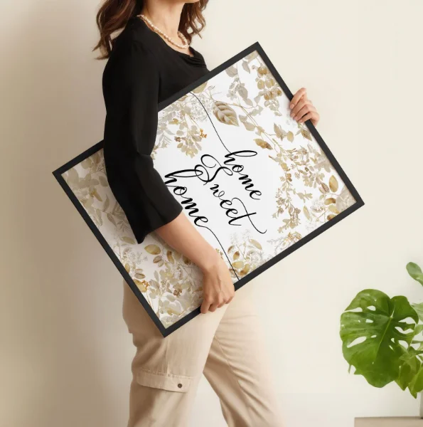
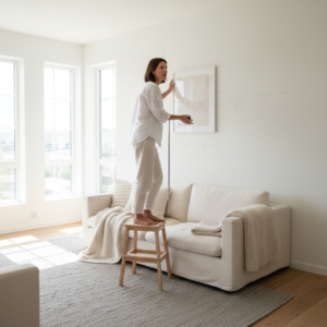
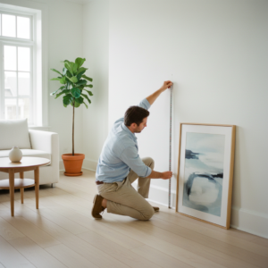
Wall art placement is one of those decorating tasks that seems deceptively simple — until you’re halfway up a ladder wondering why something that looked perfect in your head suddenly feels completely wrong on the wall.
You measure. You mark. You hang it.
You step back… and it’s too high. Or too small. Or somehow floating in space like it doesn’t belong to the room at all.
If you’ve ever felt that quiet frustration, you’re not lacking style. You’re missing a few structural principles that designers rely on automatically. The truth is, great wall art placement isn’t random and it isn’t purely instinctive — it’s built on proportion, visual anchors, spacing rules, and understanding how art interacts with furniture, lighting, and architecture.
Most common placement mistakes happen because we hang art in isolation. We focus on the wall itself instead of asking:
- What is this piece relating to?
- Where does the eye naturally land in this room?
- Is this artwork connected to the furniture or floating above it?
- Does the scale match the wall’s width and ceiling height?
When those relationships are off — even slightly — the whole space feels unsettled. Not dramatically wrong. Just subtly “off.”
In this guide, I’m going to walk you through wall art placement the way a designer would approach it from the beginning. We’ll cover the height rules that actually work, how to size art correctly for your walls, how to place artwork above sofas and beds without guesswork, how to plan a gallery wall without chaos, and what to do when you’ve already hung something and it doesn’t feel right.
By the end, you won’t be guessing anymore. You’ll understand the visual logic behind placement — and that’s what allows you to get it right the first time, confidently and without second-guessing every nail hole.
List of Contents:
- Why Wall Art Placement Feels Impossible (And How to Fix It)
- The Golden Rule: How High Should Wall Art Actually Hang?
- Wall Art Placement Over Sofas, Beds, and Consoles
- Scale It Right: Matching Art Size to Your Walls
- Gallery Wall Planning Without the Headache
- Lighting Tricks That Make Wall Art Placement Pop
- Quick Fixes When Your Wall Art Placement Goes Wrong
- People Also Ask: Wall Art Placement FAQs
1. Why Wall Art Placement Feels Impossible (And How to Fix It)
If wall art placement feels stressful, it’s not a lack of taste — it’s a lack of visual structure. Most people rely on instinct when hanging art, but instinct alone rarely accounts for proportion, architectural lines, ceiling height, furniture scale, and sightlines within the room.
The most common mistakes tend to fall into predictable patterns:
- Hanging artwork too high because the ceiling feels tall
- Choosing pieces that are too small for the wall
- Ignoring the furniture beneath the art
- Centering artwork on the wall instead of centering it on the room’s layout
- Treating art as decoration instead of as a structural design element
What makes placement feel “wrong” is usually a misalignment of visual anchors. Every room has anchors — sofas, beds, consoles, fireplaces, headboards. When artwork does not relate to those anchors, it floats. When it floats, the space feels unsettled.
The fix is simple but strategic: stop eyeballing and start anchoring.
Wall art must relate to three things:
- Human eye level
- The furniture below it
- The width and height of the wall
When those three relationships are balanced, the room feels cohesive and intentional rather than accidental.
Designers don’t guess placement. They use reference points. Once you understand those reference points, wall art placement becomes logical instead of emotional.
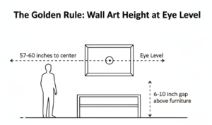
2. The Golden Rule: How High Should Wall Art Actually Hang?
The most reliable guideline in wall art placement is this:
The center of your artwork should sit approximately 57–60 inches from the floor.
This is often referred to as the gallery standard because it aligns with average human eye level. Museums use it because it allows artwork to be comfortably viewed without strain. In residential design, it creates immediate visual harmony.
Why this height works:
- It grounds the artwork within human scale
- It prevents art from drifting toward the ceiling
- It keeps sightlines consistent across rooms
However, this rule applies best to standalone pieces on open walls. Once furniture enters the equation, adjustments are necessary.
In homes with higher ceilings, many homeowners feel tempted to raise art to “fill the space.” This is rarely the right move. Art should relate to people first, architecture second. When working with curated collections from trusted sources like About Wall Art, following this guideline ensures the pieces feel professionally installed rather than randomly positioned. Even premium artwork can look amateur if placed too high.
If a piece feels wrong, the first adjustment should almost always be lowering it slightly. Even a two-inch shift can transform balance.
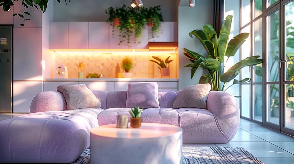
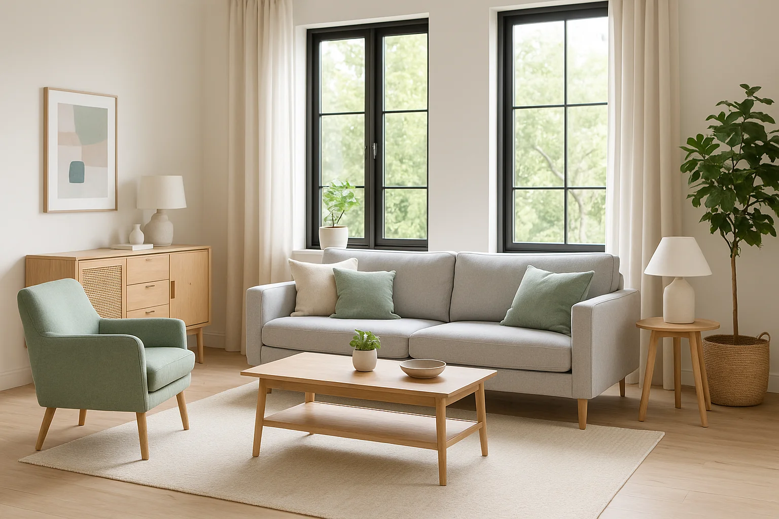
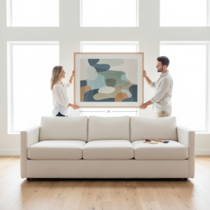
3. Wall Art Placement Over Sofas, Beds, and Consoles
When hanging wall art above furniture, the artwork must visually connect to the piece below it. Furniture acts as a base. Without connection, art appears disconnected and unstable.
Ideal Spacing
The space between the top of the furniture and the bottom of the frame should generally be 6–10 inches.
This small gap does important visual work:
- It creates a relationship between art and furniture
- It prevents floating
- It makes the arrangement feel cohesive
If the gap is larger than 12 inches, the art begins to look detached. If it’s too tight, it can feel crowded. The sweet spot is close enough to connect, far enough to breathe.
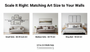
Width Rule
Artwork above sofas or beds should span two-thirds to three-quarters the width of the furniture beneath it.
For example:
- A 90-inch sofa pairs well with art that spans 60–70 inches total.
- A king-size bed (76 inches wide) works best with art between 50–60 inches wide.
Anything significantly smaller will look under-scaled. Anything significantly larger risks overpowering the room.
When hanging art above a bed, centering on the headboard — not the mattress — is crucial. For consoles and sideboards, center on the furniture body, not the wall.
The goal is always unity between horizontal lines.
4. Scale It Right: Matching Art Size to Your Walls
Scale is the silent design rule that makes or breaks a space. Too small looks accidental. Too large overwhelms.
For statement pieces or unique wall art, oversized options work beautifully on large blank walls, especially in living and dining rooms.
5. Gallery Wall Planning Without the Headache
Gallery walls intimidate many homeowners because they combine multiple placement variables at once: spacing, alignment, balance, and overall shape.
The key is to approach a gallery wall as one composition rather than individual frames.
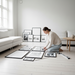
Step 1: Lay It Out First
Always arrange frames on the floor before committing to the wall. Experiment with:
- Symmetrical grids
- Organic clusters
- Linear rows
Take a photo once the layout feels balanced. This gives you a reference while hanging.
Step 2: Keep Spacing Consistent
Maintain 2–3 inches between smaller frames and 3–5 inches between larger frames.
Consistency creates cohesion. Inconsistent gaps create visual chaos.
Step 3: Anchor the Center
Start by hanging the central piece at eye level (57–60 inches to center). Then build outward.
Treat the entire grouping as if it were one large artwork. The center of the overall composition — not each frame — should align with eye level.
Step 4: Define the Shape
Gallery walls work best when they follow an invisible boundary:
- Rectangle
- Square
- Vertical column
- Horizontal band
Without a defined shape, arrangements can feel scattered. Planning eliminates guesswork and dramatically reduces regret.
6. Lighting Tricks That Make Wall Art Placement Pop
Lighting adds depth and mood. Picture lights, angled recessed lighting, and soft natural light enhance texture and color. Avoid harsh direct sunlight to protect your artwork.
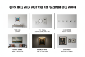
7. Quick Fixes When Your Wall Art Placement Goes Wrong
If it looks too high, lower it slightly. If it feels too small, add complementary pieces or a larger mat. If it feels disconnected, adjust spacing so it relates to nearby furniture.
People Also Ask:
- Should all wall art be at the same height?
No. Keep the center near eye level, but adjust when hanging above furniture.
- How far apart should two pictures be?
Typically 2–6 inches depending on frame size.
- Is it better to center art on the wall or furniture?
Almost always center it on the furniture beneath it.
About The Author
Mae Osz is an interior styling advisor and wall décor specialist with a passion for helping homeowners create spaces that feel balanced, cohesive, and effortlessly put together. With years of hands-on experience guiding clients through layout decisions, scale challenges, and gallery wall planning, they specialize in making wall art placement feel simple rather than overwhelming.
Their approach focuses on practical design principles — proportion, visual anchoring, eye-level balance, and spatial harmony — instead of rigid rules or fleeting trends. By breaking down designer techniques into clear, actionable steps, they help readers confidently make decisions that elevate their spaces without second-guessing every nail hole.
Through in-depth guides and styling advice published weekly at About wall Art Content Hub, the author aims to remove the stress from decorating and replace it with clarity, structure, and creative confidence.